

Graphical and analysis tools in M370/M470 software Scanning Probes – Application Note 8
Latest updated: June 13, 2024Abstract M470 and M370 instruments are controlled by the software of the same names. These software comprise a certain number of analysis tools that can be used to optimize the way the data look (as shown in SCAN-Lab#AN4) (hyperlink) and also numerous tools to optimize the way data are displayed, which can be useful when producing literature using these results or to highlight the most important aspects of the data.
Introduction
The aim of this application note is to present the numerous analysis and graphing tools available in the M470, M370, and SECM150 software, referred to collectively as the SCAN-Lab software, for the line scans and area maps. These analyses can be useful to highlight specific features and ease the interpretation of data.
Templates
When data is acquired, the different views available are shown on a toolbar at the top of the window showing the data, Fig. 1.

Figure 1: The configuration and templates toolbar.
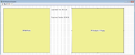
Each type of data (ac-SECM, SVET, LEIS, etc.) has its own predefined templates showing predefined values and data. In the toolbar shown in Fig. 1, the first six icons located on the right side of the “experiment configuration” shortcut are default templates whereas the three icons shown on the far right are empty. They can be referred to as a “scratch pad” for data analysis.
Empty templates can be filled by any data, either acquired or processed by the analysis tools. The choice of the data is made by right-clicking on the map, Fig. 2. This feature is available on any area map data, not just the empty templates.

Figure 2: Using the “Select View Data” option
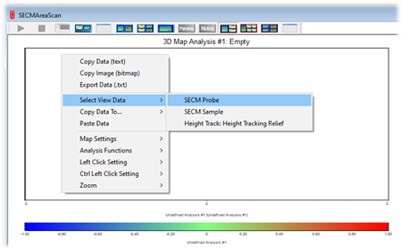
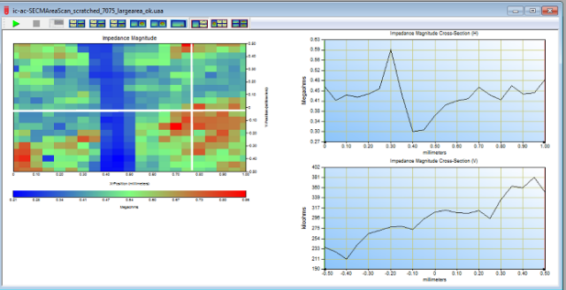
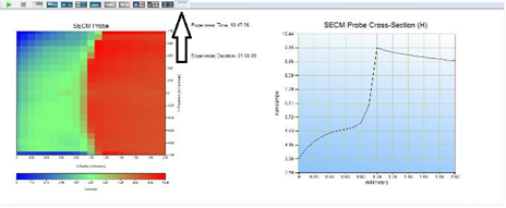
Fig. 3 shows one template where the impedance magnitude is displayed. On the left side is the area map window, and on the right side the corresponding line plot window (used for e.g. line scan, cross-section, Fast Fourier Transform), the top one corresponding to the horizontal cross section and the bottom one to the vertical cross section.
The cross sections are chosen by clicking on the area map, which chooses the intersection point of the cross section. This is the default “left-click” action, but other actions can be set as the default left-click action.

Figure 3: Template showing the area map and the corresponding cross sections along x and y axis. (Note: the cross mark was added by the author).
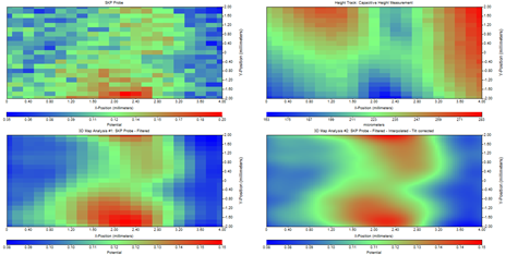
Two other empty templates are offered: The first has one area and four line plots. The specific use of this one will be shown in the next part. The last empty template offers four area scan maps, dedicated to the comparison of maps on which different analyses were performed. Again, the specific use of this template will be explained later.
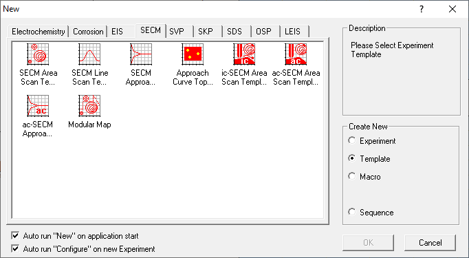
It is also possible to create your own templates, which show the desired parameters and graphs. To create a new template, the software has to be connected to the instrument, so that a new file can be opened. In the “New” menu, the “New template” line needs to be selected, Fig. 4. In the example a new “SECM Area Scan Template” will be created.

Figure 4: The “New Template” window.
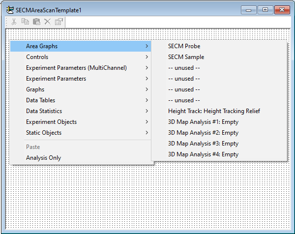
Once selected, an empty template will appear that can be populated with everything available in the default templates. This includes area maps, line graphs, processed area maps, control parameters, experiment settings, and more. They are accessed by right-clicking in the empty window, Fig. 5.

Figure 5: The empty template board and the available choices for template creation.
In the example in Fig. 6 the template has been configured to show the area map of the probe dc current response, the corresponding line scan, the experiment time and duration.

Figure 6: The chosen variables and constants displayed in the new template.
The new template must then be saved in the default location, close to the default templates, which is C:\M470, C:\M370, or C:\SECM150. It will then appear in the Templates toolbar when an SECM experiment is open as a white template, Fig. 7.

Figure 7: SECM data displayed using the newly created template.
All the data available in the experiment can be plotted as an area map but only the cross section already available in the template can be added in the new template.
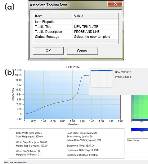
It is possible to change the parameters under which the new template icon appears in the toolbar by opening the “Associate Toolbar Icon” item in the “Template” menu, Fig. 8.

Figure 8: “Associate Toolbar Icon” item to change the parameters associated with the Template icon.
Figure 9a shows how to modify the parameters and Fig. 9b how it changes the way the icon appears. Note that “Tooltip Title” and the “Tooltip Description” appear when the mouse hovers over the icon. Note also that the “Status Message” appears in the bottom left corner of the window.

Figure 9: (a) Modified icon parameters, and (b) how the modifications appear in the window.
Area Scans
Note in the SCAN-Lab software area maps are displayed as 2D images, with the third dimension (e.g. current) shown as a color scale. For a pseudo 3D representation an additional software is required. We provide two software which can produce a pseudo 3D representation: MIRA and 3DIsoPlot®. More detail on MIRA are given in AN#5 [1], while details on 3DIso-Plot® can be found in AN#12 [2].
Map Settings
Map settings are available by right-clicking on the data window. The options available in the Map Settings menu are shown in Fig. 10.

Figure 10: The Map Settings menu options.
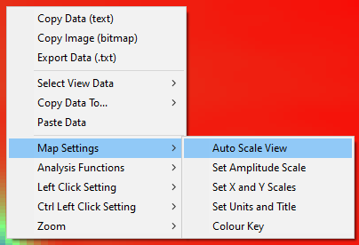
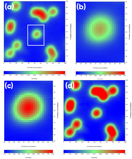
It is possible to change the contrast on the maps by adjusting the color scale. By default, the color scale is adjusted relatively to the minimum or the maximum measured values but this can be altered by the user. The scale can be manually set, using the “Set Amplitude Scale” option, or it can be automatically scaled, using “Auto Scale View”. When auto scaling the amplitudes are based on the values in the working area of the area scan. What this means is that if the user zooms in on a feature of interest they can use “Auto Scale View” to better highlight the feature. Note “Zoom” is also found in the right click menu. This is demonstrated in Fig. 11.

Figure 11: (a) SECM map as acquired, the white box shows the feature of interest. (b) Zoomed in view of the feature in the white box in (a). (c) The feature shown in (b) with auto scaling applied. (d) The full SECM map with the scale from (c) still applied.
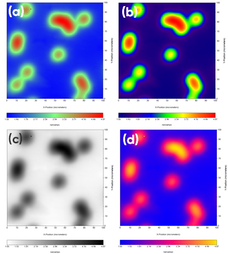
A related setting is the option to change the palette used in the amplitude scale. To access this option right click on the color key, Fig. 12. Selecting “Change Palette” allows users to select from a number of predefined palettes found in C:\M470, C:\M370, or C:\SECM150. These are identified by their .rgb file extension. By default, maps are plotted using the “Spectrum” palette. Users can also define their own palettes by selecting “Palette Editor”. Changing the palette can be of particular importance when users are looking to ensure the integrity of their area scan data when it may be printed in grey scale, or when they want to ensure maps are accessible for those with color vision deficiencies [3]. In the example shown in Fig. 13 the same map is shown using a number of different predefined palettes.

Figure 12: The area scan color palette can be changed or edited by right clicking on the color scale.
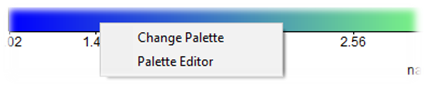

Figure 13: The same SECM map is shown with four different color palettes: (a) Spectrum (default), (b) Spectrum_Full, (c) Negative, and (d) B_P_Y.
Analysis
Some of the tools available in the Analysis Menu are explained in AN#4 [4]. The present note will cover the other analysis tools. The analysis menu is available by right-clicking on the data window of interest.
The purpose of these tools is not to provide additional data but to help the user improve and enhance the way the data appears in the case where the acquisition parameters were not optimized or if artefacts occurred during the acquisition of the data. For cases where data cannot be adequately enhanced the experiment should be re-run.
Most of the analysis tools perform an operation on each point of the data. Notable tools are:
“Curve Subtraction”: Allows the user to remove from the data a polynomial fit of the data (up to order 5), selected by the user. For “Curve Subtraction”, the user defines along which axis the best fit is performed.
“Tilt Correction”: A particular case of “Curve Subtraction” for which a polynomial of order 1 is used and the tilt is calculated in both x and y axes.
“Curve Fit”: Generates fitted data through polynomial regression. As with “Curve Subtraction”, the user defines the axis along which the fit is performed.
For any analysis, the user defines an empty window which will be populated by the resulting data using the “Select Destination for Result” field. There are four empty analysis windows available. In order to display the data, the user should select an analysis object.
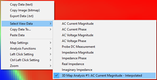
When a window is populated with data it will appear in the “Select View Data” line (accessed by right-clicking in the data and selecting the “Select View Data” option or by selecting an appropriate analysis template that will display the data) with a reminder of the operation performed. In Fig. 14, one can see that one operation was performed in the data located in the empty window #1.

Figure 14: Analyzed data appears in the “Select View Data” option of the right click menu.
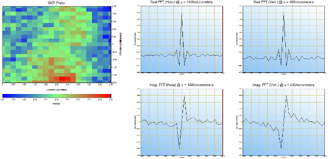
Another available template displays one area map and four different line scans. This template is specifically dedicated to the 2D Fast Fourier Transform (FFT) analysis. As an area map displays data along the x and y axis, FFT can be performed to determine the spatial frequency of features.
As the Fourier function transforms real data into complex values, both the real and the imaginary parts of the data can be shown on each x- and y-axis as can be seen in Fig. 15. The data chosen for the FFT are the horizontal and vertical lines intersecting where the cursor is located, as the Analysis function is accessed (right-click).

Figure 15: 2D FFT displayed in the second default template.
The default templates can be populated with the analyzed data, for example the data obtained after each analysis can be displayed simultaneously and compared, Fig. 16.

Figure 16: The four area maps displayed simultaneously.
Useful Tools for Topography Maps
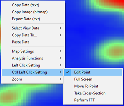
When topography maps have been measured with the intention of using the resulting data as an input for a height tracking measurement it is at times necessary to perform post processing. This is required to ensure erroneous data is not used in the height tracking measurement. In the best case this can result in erroneous data carrying through to the final measurement, while in the worst case it can result in probe crash and possible damage to the instrument. In these cases, there are two tools which exist to correct the data: Edit Point and Paste Data.
The Edit Point tool needs to be set to either the Left Click or Ctl Left Click Setting through the area map right click menu, Fig. 17. Once set, a (Ctl) left click on the data point of interest will allow it to be edited.

Figure 17: Using the right click menu Edit Point can be set to the left click, or Ctl left click.
From the area map right click menu it is also possible to access “Paste Data”. The typical use of this tool when working with topography data is to edit the copied data in another software, for example Excel, before copying it back into the SCAN-Lab software.
For information on the best practices for maps used for topography measurements please see TN#14 [5].
Line plots
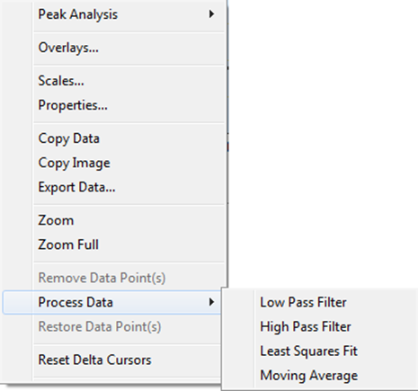
There are a number of analysis tools available for the line plots. These are accessed by right clicking on the line plot, Fig. 18.

Figure 18: Analysis tools available for line plots.
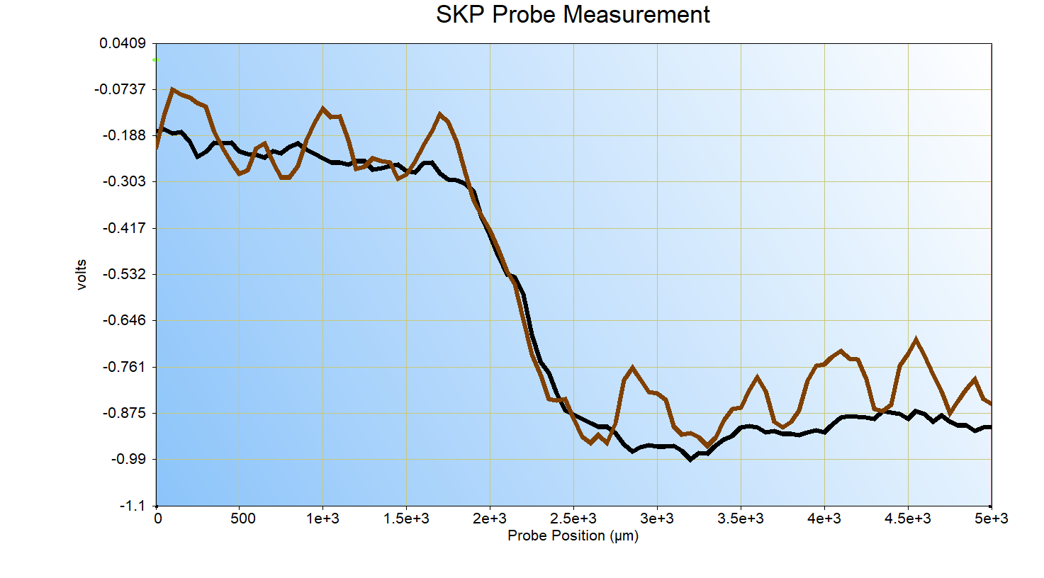
When working with line plots of any kind, it is often beneficial to have multiple plots on a single axis, to allow straightforward comparison. This is possible using the overlay tool, accessible in the right click menu as the “Overlays…” command. This is demonstrated for two SKP line scans, used to tune settings prior to running an area scan, in Fig. 19.

Figure 19: The option to overlay line plots is demonstrated with two SKP line scans.
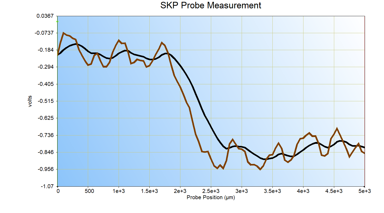
It is also possible to smooth the data or filter the data using the “Process Data” commands. The Low Pass Filter removes high frequency noise from the line plot, while the High Pass Filter removes low frequency data from the line plot. The Low Pass Filter is demonstrated on the brown SKP line scan from Fig. 19, in Fig. 20.
Figure 20: The original SKP data is shown by the brown trace, while the black trace has had a low pass filter of 0.05 applied.
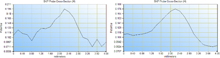
The Moving Average tool also allows data to be smoothed. In this case a moving average of the data is determined over a point window set by the user. An example is demonstrated in Fig. 21.

Figure 21: Left: raw data; Right: After applying a moving average with a 5 point window. Data is shown side by side for clarity.
A final tool of interest in line plots is the “Remove Data Point(s)” tool, which is greyed out in Fig. 18. In some cases, particularly when data is to be fitted, it can be beneficial to remove spurious points. This is possible by clicking on the data point(s) of interest, and selecting the “Remove Data Point(s)” option. This is also used for spurious points in approach curves to be used in the Approach Curve Extrapolation Experiment, as outlined in TN#22 [6].
Conclusion
Some of the advanced analysis and graphing tools available in the M470, M370, and SECM150 software were introduced in this document. These tools can be used to ease the interpretation of data and help extract the most useful features of the data. Formatting the data also helps present the most interesting aspects of the results.
For more detailed information on any of the tools mentioned in this Application Note please see the HTML help file of the SCAN-Lab software of interest.
References
- SCAN-Lab Application Note #5 “Introducing the Microscopic Image Rapid Analysis (MIRA) software”
- SCAN-Lab Application Note #12 “3D Map production using the 3DIsoPlot software”
- F. Crameri, G. E. Shepard, P. J. Heron, Nature Communications, 11 (2020) 5444
- SCAN-Lab Application Note #4 “Post-treatment and optimization of area scan experiments”
- SCAN-Lab Technical Note #14 “Height Tracking Inputs for SKP Investigations”
- SCAN-Lab Technical Note #22 “Introducing the Scanning Electrochemical Microscopy (SECM) Approach Curve Topography Extrapolation Experiment”
Revised in 07/2023


